
Company
Intact
Belairdirect (Subsidiary)
Role
UX/UI Designer
Duration
6 months
Fall and Winter 2019
Collaborated with
Business Analysts (1)
UX Designer (1)
QA (2)
Development team (3)
PM (1)
Other teams
Summary
This is a project that was completed while I was working at Intact / Belairdirect, a large insurance and financial services provider in Canada.
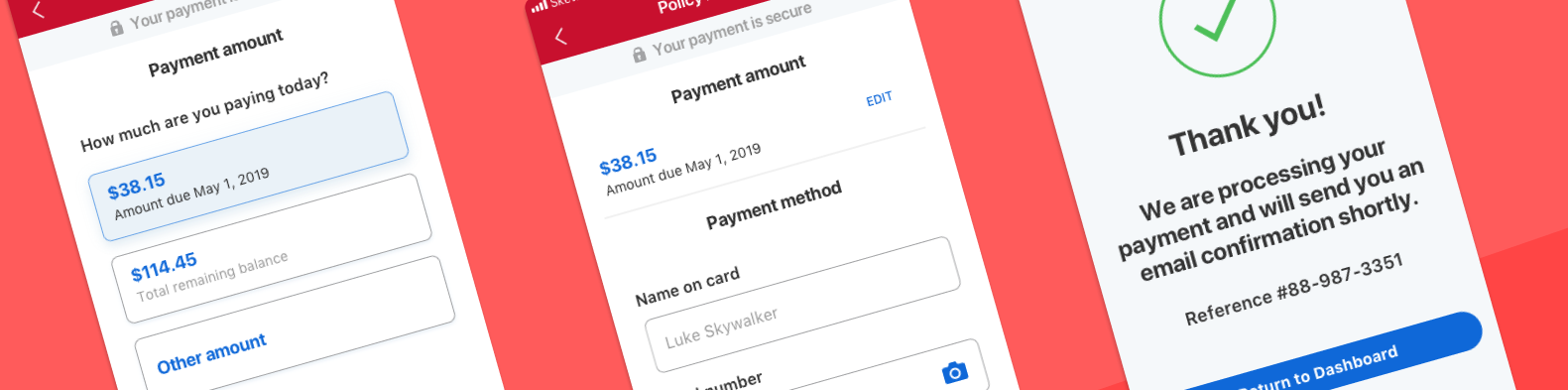
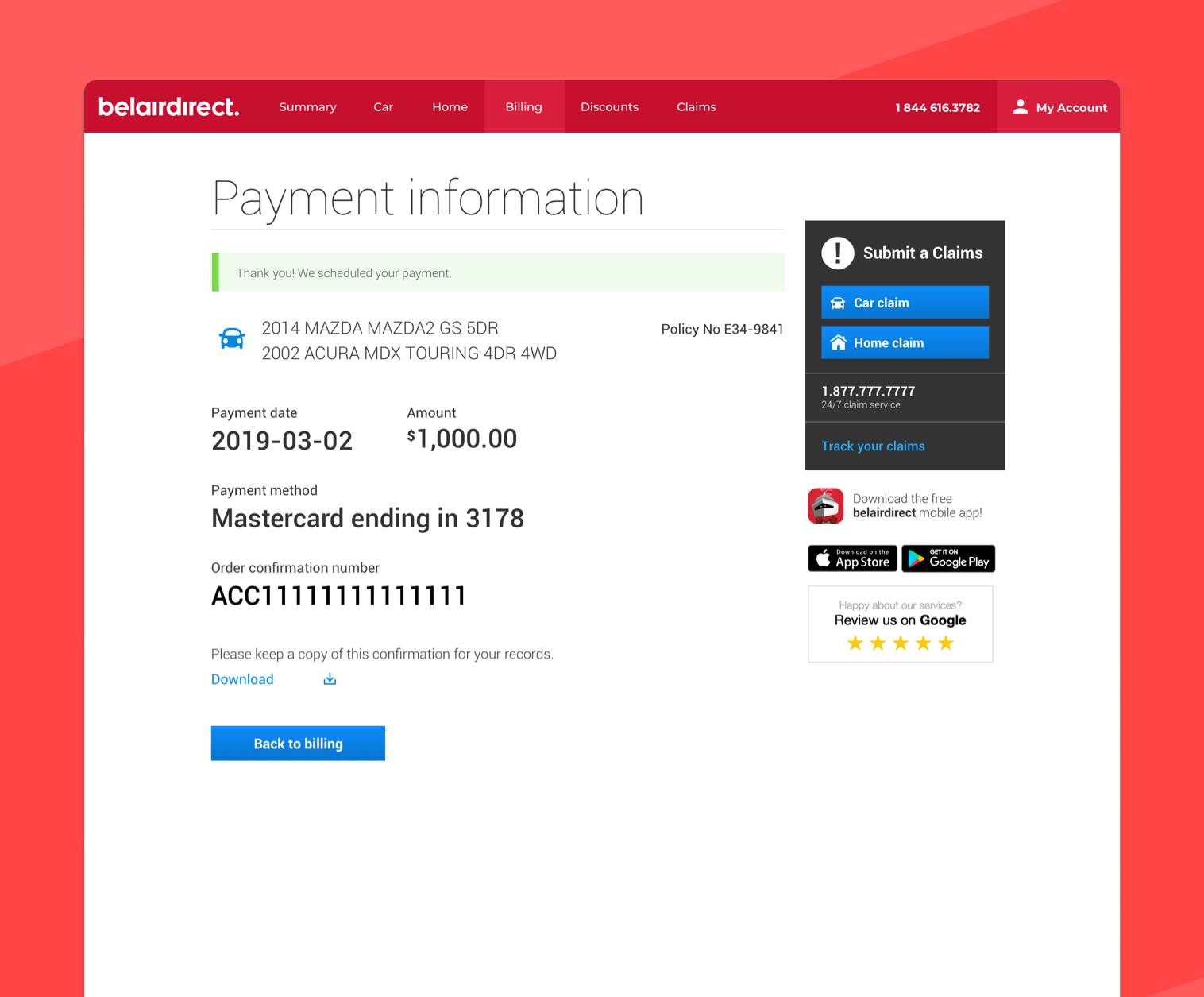
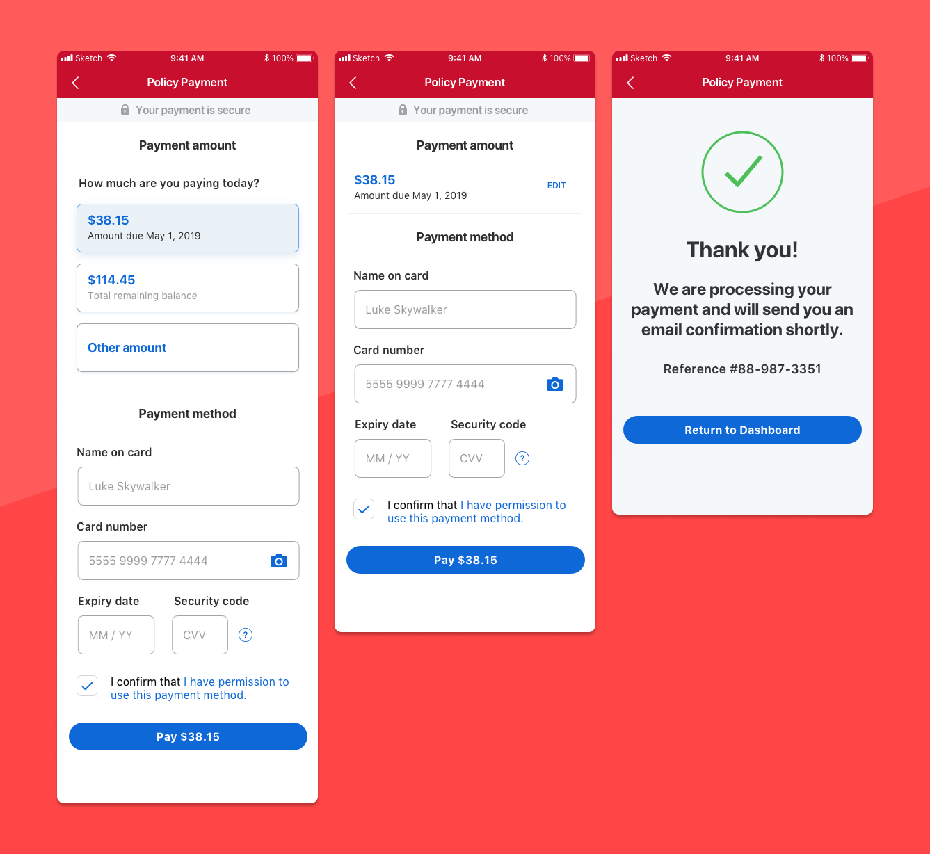
I worked with another designer, developers, and multiple cross-functional teams to redesign a billing system used by millions of customers. I was responsible for redesigning the billing experience on desktop, and worked with another designer to add a new billing experience to the Android and iOS applications.
The problem
Intact serves an extremely large and diverse set of customers, all with slightly different needs from their insurance provider. One of those needs is how they pay online. I was tasked with redesigning the online billing and payment experience on the website. I worked with another designer on the mobile experience. At the beginning of the project, the Intact / Belairdirect iOS and Android applications had no billing or payment functionality.
Existing system
There were multiple reasons to update the billing experience:
💳
Offer new ways to pay (e.g. Google Pay)
We were aware that many customers used new payment methods, and we wanted to offer this flexibility
📅
Increase the clarity of online payment schedules.
Insurance payment schedules can get complicated, and were a frequent source of contention.

Research
I worked with different teams and colleagues to collect as much information about the existing system before proceeding to any design.
Internal Research
As part of our internal research, we dove deep into what currently existed and existing issues.
We:
- Worked with Business Analysts to map out existing payment workflows, including many, many edge cases
- Ran a focus group with Call Center agents to discuss pain points in terms of billing
- Collected statistics on the different payment plans and methods our customers were currently using.
- Analyzed app reviews
- Read previous interviews conducted with our customers

Competitive Analysis
I worked with one of our user researchers to get a sense of what features our competitors were offering. We examined 10 direct competitors (Insurance companies) in depth, across both the Canadian and U.S. markets. We also examined the billing systems of over 40 different services from different industries, such as personal finance and telecommunications.


The research gave us several key insights into the billing experience.
💸
Our customers expect to pay how they want
Customers had changing expectations of how they should be able to pay their bills online. As more payment methods are adopted such as Google Pay and Apple Pay, our customer expect us to support these methods.
😧
Billing is emotionally sensitive
Money is important. With our system, it was important to make sure that customers felt safe and confident that our system was secure. Adoption would heavily depend on how designs felt on an emotional level.
💻
Customers often prefer do-it-yourself options
One of the themes that emerged very strongly from our customers is the importance of self-serve options. If customers can handle administrative details themselves, it’s perceived as a convenient and flexible option.
Redesign
Usability testing
This project involved lots of usability testing as we experiment with different designs. I was responsible for all testing on the web version, and my colleague conducted mobile tests. We used both moderated and unmoderated testing.

Some usability issues were discovered, and a few design choices were changed based on testing.
The new online billing system


Measuring outcomes
- Within the first month, we received over 7,500 payments using the new system.
- Completion rates on payment forms were increased by over 20% to 81%.
- Call volume to our call centers in regards to billing was significantly decreased. Unfortunately I don’t have the statistics for this one!