

Company
Jonar
Role
UX/UI Designer
Duration
August – October 2017
Collaborated with
Marketing Team (2)
Managing Director (1)
Other teams
Summary
Jonar is a software company in Montreal that builds and sells applications for small businesses. I worked at Jonar for 2 years, primarily designing their flagship ERP application and website.
I was the UX Designer responsible for this project. My responsibilities included all research, design and some of the implementation via our CMS. I worked with various teams across the company to get the project done. Several key issues were discovered with the website navigation, the homepage and content. Addressing these issues resulted in both more leads and increased visits to hidden content.
The problem
In order to achieve fast growth, we needed to increase the number of leads generated by our website.. Furthermore, our sales team indicated that many qualified leads weren’t finding they needed to on our website to make purchasing decisions.

Research by proxy
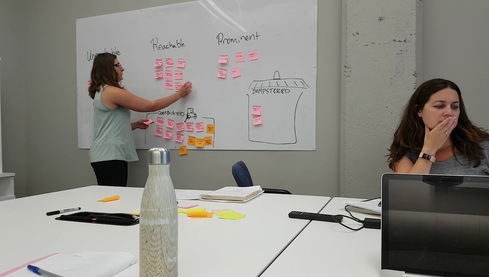
The people who make purchasing decisions about this class of software are quite difficult to reach, and often aren’t available for user testing or interviews. As a result, this project relied on lots of “guerilla research” with new interns and acquaintances outside the company.
Information from sales team
The sales team had some of the closest contact with the potential users. So I gathered information by proxy by discussing with them. They indicated that based on the questions customers were asking, our customers were probably struggling to find our documentation.
Informal testing
In order to understand why users were struggling to find information about our software, I conducted informal usability testing of our website. The main insight was that users were really struggling to find relevant information that was available online.
💻
Users estimated the number of pages on the website based on the number of items in the navigation, which hid most of the content.
🤨
While the call-to-action on the front page was obvious, it was unclear if it led to sales content, documentation or even a trial.
🔍
Users looked for design patterns such as a footer and search, and were surprised they weren’t available.

Redesign
Auditing our content
Before redesigning our navigation, I worked with the marketing team to conduct an audit of all our web pages. As part of this process, we found lots of duplicated material, and gaps in the documentation of our software. Some pages were condensed, and others were added.
Better navigation
We made extensive changes to the navigation in order to highlight all the great content about our software. In each case, I also relied on studies from HCI literature to help guide the design. In some cases, additional design activities such as card-sorting were conducted to determine how to sort content.
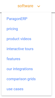
Adding dropdowns to the menu
In order to make our content more discoverable, I completely rearranged our top menu. We also included dropdowns, as dropdowns are associated with lower search time.
Added a search
Our sales reps told us that potential clients frequently struggled to find pages they had seen before. For example, a lead may have been sent a direct link to product documentation, but could no longer find the page using the navigation. The search was added to mitigate this. Having an easy-to-find search is also a design pattern that is strongly recommended.
Moved our logo out of the way
In the previous menu, the logo split the options onto two sides, which made the menu harder to read. Research also suggests that website logos are best placed in the top left of the webpage.
The new menu

Redesigned homepage
The homepage was redesigned to place a focus on our software, and also offer better call-to-actions. At the same time, it was important for us to keep the playful identity that was part of Jonar’s branding.
A lot of time was spent discussing what was more important to our customers, what was important to Jonar, and looking at previous internal research. Ultimately, we kept the playful style, but I designed the homepage to include much more information directly to potential customers.
I also took this opportunity to move the way our website was structured on our CMS to a more modular system. This allowed for more flexibility in terms of future changes, and quicker development.


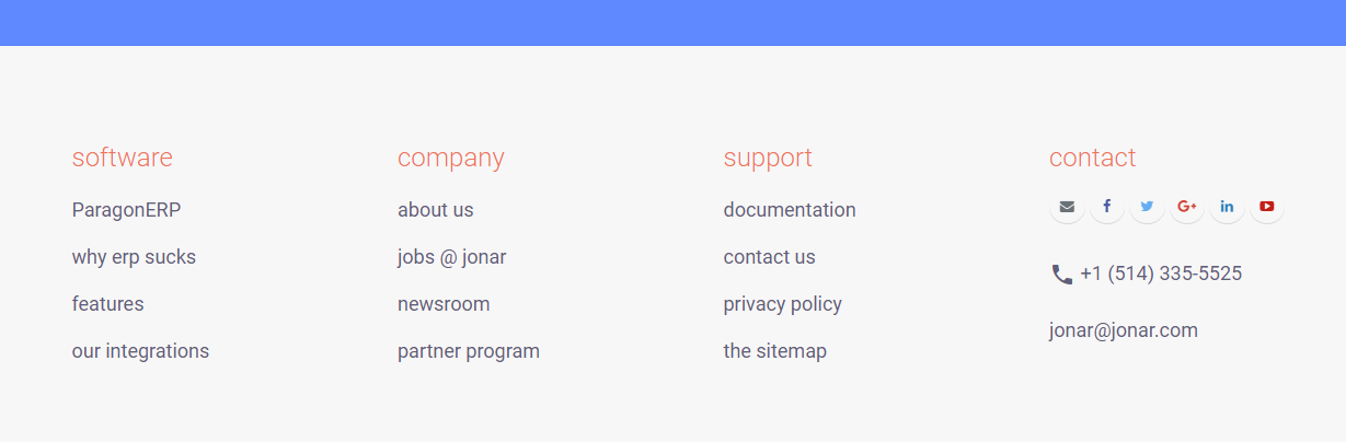
Addition of a footer
I designed and added a footer to the website. This was done because our main issue was a lack of navigation to content. Footers provide a great, and expected, way to quickly navigate websites.
The new homepage and navigation

Measuring the results
We measured results in a variety of ways.
📧
Leads
The most positive signal was that the monthly leads contacting Jonar via our website more than doubled on a month-to-month basis.
📈
Analytics
Using Google Analytics, we also saw that rarely visited pages had increased traffic.
We also noticed a decrease of average time on page of about 10 seconds. At first, we thought this might suggest that users were struggling to find the information they were looking for. However, given that more people were actually entering the sales funnel, it’s also possible that people were now able to make quicker decisions about whether they wanted to contact our team or not.
One caveat is that this was such a large overhaul, it’s difficult to ascertain exactly which changes had the largest impact. Despite this, the redesign was successful and led to an increase of leads entering the sales funnel.